
I imagine this image cut out from the background using Photoshop, with a black background and limited colour palette - colours such as red, black and white will be used. I may increase the brightness and contrast of this image so that the eye makeup/lips and hair/skin stand out against eachother.
The image below is one that I was going to use for the front cover, however instead may use for the contents page/double page spread. The reason I changed it is because I think the image above displays the genre more, as it is darker and the model is looking away, I think it looks more professional.
I think again I may cut this image from the background and possibly turn the image black and white and use selective colour to highlight the red aspects, as these are my main focus colours. I also like how you can decipher that these are from different shoots, which seems professional as there is variety.

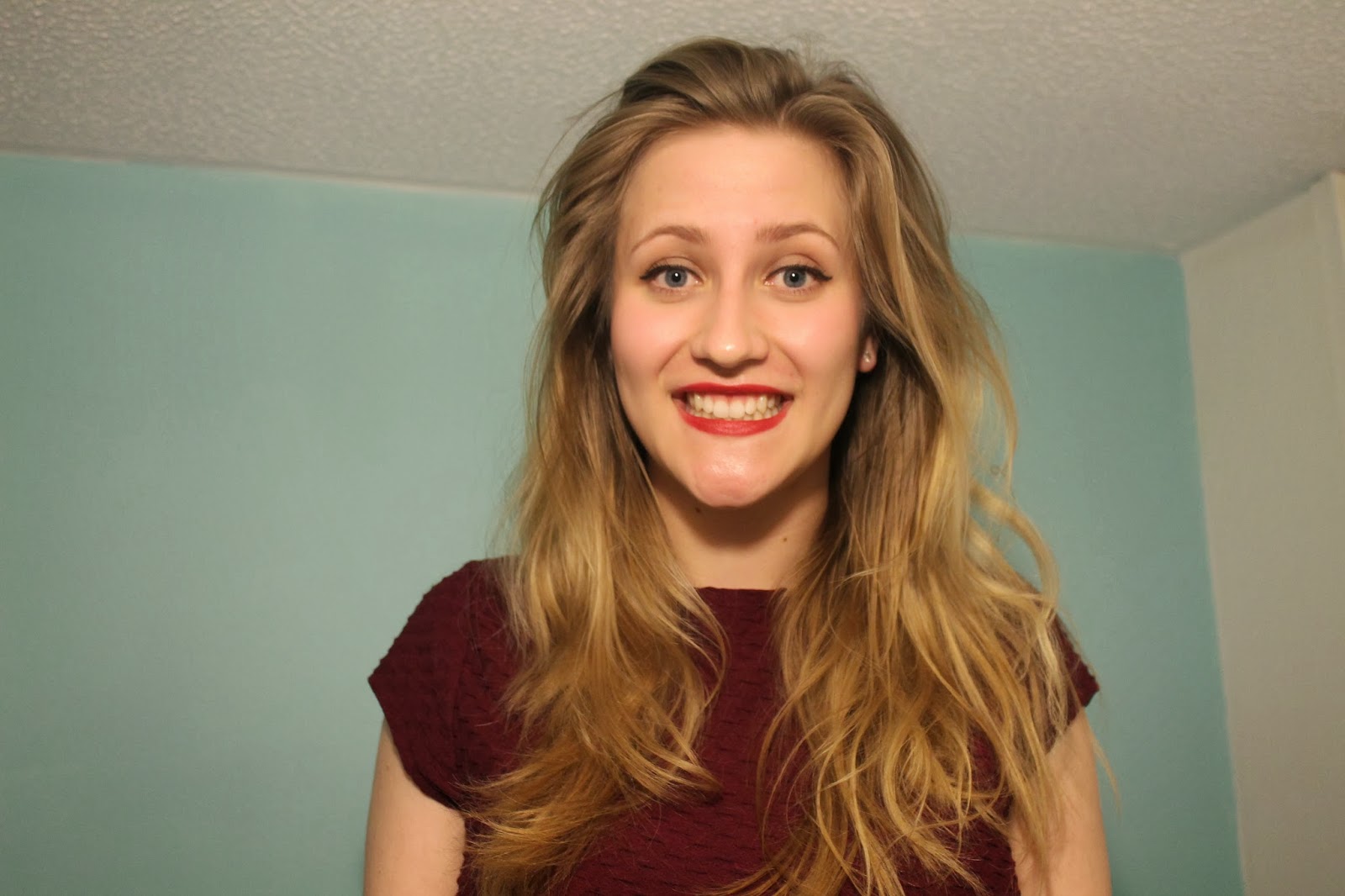
I wanted a vertical image for my double page spread, so that it could be in line with the text colums, so I may cut out this image from the background and use this one. However, because it is a midshot and her hands arent shown, I will have to put something infront of her such as a quote or banner/subheading so that it doesn't look strange/out of place.

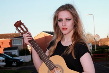
This is an image that I thought I was going to use, however when thinking about how it will look in my magazine, I think it will look 'cheesy' and unprofessional, and therefore will not involve it. I liked this shoot as the model had a guitar, which signified music and allowed the audience to decipher the genre of my magazine, however I can resolve this problem by adding symbols to the cover such as a musical note beside the masthead.
No comments:
Post a Comment