Friday, 2 May 2014

EVALUATION QUESTION 7

I think I have learned a lot since creating the preliminary task.


Although I created this on Photoshop, it is extremely amateur and unprofessional. To begin with, the masthead on the front cover is spelled incorrectly, the photographs are not to a good quality/high standard, the text and font is repetitive and the colour scheme lacks variation. As well as this, I only had 1 hour to create this magazine and there is a lack of magazine conventions such as the price and date - the only essential piece of information is the bar code.
 
 
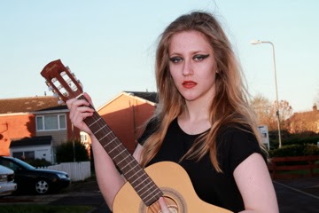
I also created a magazine front cover a few days later as extra Photoshop experience before creating my actual music magazine.
 
 
This front cover is slightly more professional however still very unrealistic. I think the masthead being placed behind the main image makes the magazine look professional, however the images on the cover are taken from the internet and again, the font and colours are limited. This magazine has more conventions than my preliminary task, such as the price and more coverlines, however is still not to a high standard.
 
Since creating these magazines, I have gained more Photoshop experience, learned how to take more successful photos and knowledge about working in a studio. I have also learned more about the layout and presentation of a realistic magazine and how conventions and images add to the realism of magazines. In addition, I have learned more about gathering information, opinions, mode of address and how to attract a targetted audience.

EVALUATION QUESTION 6

This is an image I created on Photoshop demonstrating the physical and digital equipment I used in the making and the research of my magazine. This includes Prezi, Slideshare, Photoshop, Blogger, Apple technologies (e.g Mac computers and my Macbook), and my DSLR Cannon 110D. I also used Youtube, scribd, a scanner, dafont and bighugelabs.  The use of technologies influence my magazine majorly, as I was able to research my audience more, produce higher quality images, edit my magazine and create it on professional software, and keep all of my coursework together on a blogging website, which helped in the organisation of my work. It also gave me the chance to hyperlink aspects together, refer back to things easily and work outside of college. I hadn't used almost all of these programmes before, so it was a learning experience as well as a helpful and more professional way of working.

EVALUATION QUESTION 5

 
I created a powerpoint to explain how I attracted and addressed my audience.


EVALUATION QUESTION 4


I created a slide-show on Prezi, including screengrabs from my survey, to display who the audience would be for my magazine.

Thursday, 1 May 2014

EVALUATION QUESTION 3


I used Microsoft Word to write up the answer to this question, and then I used Scribd.com to embed it into a blog post.

Wednesday, 30 April 2014

EVALUATION QUESTION 2

 
The particular social groups of the NME magazine and my magazine are extremely similar, so I wanted to create a similar image to those seen in NME magazine. Firstly, the composition and shots are both the same - central and close up. Once I had edited my image on Photoshop, the vibrancy and contrast became similar to that of NME magazine. I did this so that the image was brighter and looked more professional. Similarly, I wanted to use a colour splash of red in my image, but because the model does not have red hair, I used lipstick instead. Once this was brightened on photoshop, it was almost as bright as the hair on the male model for NME. I wanted the hair to be almost as messy, so I took this photo in an outdoor shoot on a slightly windy day, but not so much that it caused problems. The main difference is the lighting - I used natural lighting however NME have used studio lighting. I took this into consideration, which is why my other images were studio-based. I kept the clothing almost the same - both black with some neck showing - so that the colour reinforced the genre of the magazine, and so that the hair and makeup would stand out a lot more. Overall, I think these elements of the photos represent the social group of my magazine - gender-neutral audience with an interest in rock/indie music. Also people who enjoy going to concerts and festivals and discovering new music.
 
I created this side-by side comparison of images by using Photoshop.

EVALUATION QUESTION 1


I used Prezi to create a Powerpoint-style presentation animation board to show the conventions of my magazine and how they link to present music magazines.

Tuesday, 1 April 2014

FINAL DOUBLE PAGE SPREAD

This is my final double page spread. I removed the heart logo as it was pointless, and instead created a two-column interview rather than one, to fill up further space. I kept the same image to link it to the front cover and also added the title of the magazine in the top left corner to anchor it to the publication. I also kept the same font for the front cover 'Ellen Louise' and the word 'Astronaut' to link it further, and finally added an advertisement for her album at the bottom of the page.

FINAL CONTENTS PAGE

This is my final contents page. Mainly, I added more images to the contents page to show a larger variety of what is included in my magazine. I placed the original front cover image on this page, as I wanted the cover image to link to the double page spread, not the double page spread picture to link to the contents page. I kept the colour scheme to black, white and red again to continue the theme, added page numbers to the images to show which pages they will appear on, and as I want this to be an every two week publication, had an accurate amount of page numbers for a biweekly magazine. 

FINAL FRONT COVER

 This is my final front cover for my music magazine. I did some alterations, for example I changed the image - this was to make my magazine link together more successfully. I thought the other image made the front cover look like a different magazine, so I am using this image for anchorage to the double page spread interview. I moved the masthead layer on Photoshop so that the 'Uproar' text is behind the image, which is a typical convention for music magazines. I included essential information, such as the bar code, date and magazine website. I kept the colours to a minimum, for example the black and white, and the small red in the top right corner - this is to add anchorage to the rest of the magazine. I included an 'also in this issue' section to work as a coverline, as I did not want many placed around the page. This will link to the contents page and hopefully entice readers.

Thursday, 6 March 2014

PHOTOSHOP PROGRESS 6/3/14

This week I created my front cover. I uploaded the masthead that I had drawn and scanned and placed it on a black background. To get the photo infront of the masthead, I simply moved the layers. I wanted it infront as it is typical for magazines to do this. I wanted a white border around the image to link it to the coverline and masthead. The grey box which supports the bottom coverlines is a darker white as I wanted to vary it as it is less significant than the coverlines and masthead as it is just a background colour. I added essential info such as barcode/price as this is important to add to a magazine cover. I used black and white for contrast, so that my magazine would stand out.

Friday, 28 February 2014

PHOTOSHOP PROGRESS 28/2/14

For my front cover, I wanted the masthead to be an original font, to make it stand out. To achieve this, I drew the font I wanted by hand and then scanned it into the computer. When I first scanned it, I had only drawn it in pencil, so it wasn't visible. Therefore, I had to draw it again with a marker, which made it more prominent and noticable. I then inverted the colours on Photoshop, as I wanted the text white, and the background black - this is because the background for my front cover is black. To finish off, I smoothed the edges with a paint brush as they were slightly pixelated, and placed it at the top of the cover.

The font I have drawn almost looks as though it is dripping, and has a slime effect, I drew it this way to fit the genre of the magazine and make it different to other mastheads on other magazines.

Friday, 14 February 2014

PHOTOSHOP PROGRESS 14/2/2014

This week, I created my double page spread.

To begin with, I wanted to choose a sort of theme for the article, so I chose science, space, and what Ellen studied in school/college. This linked to the masthead 'I wanted to be an astronaut...' and how this is a pull quote from the article, similarly, I used a pun/joke as the tagline, 'The singer who wanted to be on top of the world - now she's on top of the charts!' I kept the colour scheme quite simple, with dark red (to match her dress), black and white. After writing the article, it became apparent that there was large white space that I wanted to get rid of, so I placed a heart there, by using 'custom shapes'. I also added an outer glow, to link it to the outer glow on 'astronaut. To finish off, I added a page number and a box at the bottom to give information about the album and release date. I plan on starting my front cover as soon as possible.

Tuesday, 4 February 2014

PHOTOSHOP PROGRESS 04/02/2014


I began with the photo I am using for my double page spread. I used the quick selection tool to cut around the model and to delete the background, however once the background was gone, you could still see gaps of it through the hair. To resolve this, first I tried to use the magic wand tool/quick selection tool to delete it, however the flicks of hair you can see in the image beside the blue gaps looked strange, so I used a youtube tutorial to find out how I can make the hair look realistic however so the background was gone. Here is the youtube tutorial. Once the hair was smooth enough so that it still looked realistic, I used the eraser tool to erase the hair that is seen flicking out at the side beside the background gaps. You can see this in the finished edit:


The reason you can't see the other arm etc is because this is how I would like it to look on my double page spread, so beside the image on the left is where the columns of text would be. In addition to this editing, I also used the clone stamp tool to airbrush the image.

Tuesday, 28 January 2014

COLOUR PALETTE

The first row of colours, demonstraing black, grey and white, are possible background colours. It is most likely that I will use black as the background colour as white (or red) text would stand out greatly against it, and it would make the image more noticeable and detailed. It would also reflect the genre of my magazine and reinforce the genre to the audience. The reason I considered a grey background is because it would act as a middleground between black and white, incase either was too contrasted.

The middle colours demonstrate different shades of red that I will consider using for my magzine. In the images, the model is wearing a red/burgandy dress, so the colours may match. If I want the colours to match completely, I could use the colour picker tool on Photoshop so that I can use the exact colour of the text on the double page spread, alongside the dress. It is likely that I would use the first colour, as the other two are rather bright and the last is quite pastel. It is most likely that I will use the colour of the models dress.

The last line is possible text colour, if I didn't want to use black. E.G, for coverlines on the front cover, as I wouldn't be able to have black text on a black background. I like the middle option mostly as it isn't too dark however isn't completely white, so if it was beside white text there would be a slight contrasting difference.

Thursday, 16 January 2014

FONTS

I am going to sample and explore a variety of fonts to see which one would work well in regards to coverlines and subheadings etc. I plan to draw my masthead and later scan it and apply Photoshop work to it to make it a more original font, however still need a style for basic text.


The font above demonstrates Helvetica, which I think would work well especially for the double page spread/interview as it is easy to read and understand. It's simple and is used regularly by other publications.


This example is Century Gothic. I like this font as it's simple and easy to read, although it looks slightly informal, I don't think it would look successful in large quantity on a double page spread or a contents page.

The above example is called Adobe Fan Heiti and I think it's almost a middleground between Century Gothic and Helvetica - it's formal and also informal, but not too much of either. It is likely that I would use this font in my magazine on either the double page spread or contents page.
This is an example of a font that I think would be far too formal for my magazine, due to the audience target age and also genre. It's far more formal than all of the ones above and wouldn't likely be used in a music magazine.

I think this font, Showcard Gothic, is much too informal to use in my magazine, as in large quantity I think it would be quite difficult to read, and also due to how bold it is it would take away the audience's attention from other aspects of the page.
 
I don't want to use a font such as this one (Lucinda Handwriting) because I think a handwritten/calligraphy font would be too informal and distracting, and it may also be very difficult to read. I think a printed font such as the first few I demonstrated would work much better.

Thursday, 9 January 2014

PHOTOS FOR MY MAGAZINE

 
When taking photos, I conducted 2 photography shoots. The first was an outdoors shoot and the second was an indoor shoot. Through the outdoor shoot, I have created a front cover image, seen below:

I imagine this image cut out from the background using Photoshop, with a black background and limited colour palette - colours such as red, black and white will be used. I may increase the brightness and contrast of this image so that the eye makeup/lips and hair/skin stand out against eachother.
The image below is one that I was going to use for the front cover, however instead may use for the contents page/double page spread. The reason I changed it is because I think the image above displays the genre more, as it is darker and the model is looking away, I think it looks more professional.
 
 
I think again I may cut this image from the background and possibly turn the image black and white and use selective colour to highlight the red aspects, as these are my main focus colours. I also like how you can decipher that these are from different shoots, which seems professional as there is variety.
 

I wanted a vertical image for my double page spread, so that it could be in line with the text colums, so I may cut out this image from the background and use this one. However, because it is a midshot and her hands arent shown, I will have to put something infront of her such as a quote or banner/subheading so that it doesn't look strange/out of place.
 
 
This is an image that I thought I was going to use, however when thinking about how it will look in my magazine, I think it will look 'cheesy' and unprofessional, and therefore will not involve it. I liked this shoot as the model had a guitar, which signified music and allowed the audience to decipher the genre of my magazine, however I can resolve this problem by adding symbols to the cover such as a musical note beside the masthead.
 

Thursday, 2 January 2014

CONVENTIONS, PRODUCER AND TARGET AUDIENCE

I plan to use many conventions on my front cover. The colour palette will be low key to suit the genre, however I will try and make this effective nonetheless. There will be a dominant image on the cover, although I do not plan on using sub-images and I am aiming for a more clean, easy to read layout with a lack of clutter, however there will be coverlines/subheadings. Textual elements will reinforce the genre and target audience age, so there may be aspects of colloquial lexis. In the contents page, there will be limited colums of text as I don't want to bore the reader or make the page look full and unclear with a large amount of text, there will also be a large image on the page and the title will run across both pages. The contents page will feature a main image with a quote across it, and pages will be ordered at the side and a subscription option may be at the bottom of the page, this may also include special offers to entice the reader.

A producer that may distribute my magazine if it were available to sell, would likely be Freeway Press, as it produces Rocksound, which is a very similar magazine to the one I plan to create. You can see my producer research here. I would choose this producer as Rocksound is a very successful magazine, is published weekly, has the same target audience as I plan to have, the same genre almost, and in regards to my audience research which is here, has the expected cost of a magazine and, from what my survey gathered, has the expected aspects of a music magazine. In my opinion, Rocksound would be my preferred music magazine for this target audience/genre. 

The target audience of my text would be people who are interested in upcoming, new rock/indie bands. This may include unsigned bands, new bands in local areas or bands from other places of the world that fit well with the magazine genre. Age groups would vary from 16-late 20s, and it would appeal to both genders. Characteristic behaviours that my target audience may share would be enjoying going to gigs/festivals, and an interest in discovering new music. 

Media platforms and broadcasters that may be interested in promoting my magazine may be festivals/radio shows etc. For example, if my magazine was on an advertisement at a music festival based around the genre, people with the characteristics and music taste would see it and be persuaded to possibly purchase it as it would appeal to them. A radio show such as Zane Lowe on Radio 1 may be interested in my magazine as it fits the genre of the music he plays and the audience who listen to the show. Outlets that would be interested in selling my magazine may be news agencies and supermarkets; these outlets sell similar magazines already. 

LOCATION FOR PHOTOSHOOT

1) Are there any hazards that could disrupt the photography shoot?
- When filming outdoors, hazards could be traffic, pedestrians etc, however when shooting indoors there will be less hazards, the only ones indoors would be wires/clutter. 

2) What will you do to ensure these risks are minimised? 
- To minimise these risks, I will photograph the model in a more enclosed location, away from busy traffic/the public, and when filming inside, I will make sure the room/studio is tidy and take safety precautions.

3) Will the time of day/weather affect the outcome of the photographs? Have you allowed for this?
- Due to taking photos both inside and outside, I can plan the shoots so that if it's going to be a rainy day, I can shoot inside, and if it's going to be a dry day, I can shoot outside. 

4) Have you considered the background, especially if filming outside?
- If filming outside, I will use a background that isn't too crowded, however that isn't completely blank. This could be a few trees, however not so much so that the model isn't the main focus. I will make sure to keep the model as the main focus, so it may be possible that only a small aspect of the background is visible.

5) Have you considered lighting? What about the ‘problems’ of natural lighting, either outside, or streaming through a window? Will you need to use a flash? Have you considered reflective objects that might spoil the effect?
- I have considered using a flash light/soft box when working in the studio, and if I wanted a tint of colour I could also use gel filters. When filming indoors, if a natural light source is coming through a window, I can always close blinds/curtains or cover the window with something such as card. When filming indoors, I may use a flash to increase contrast, especially if using a black background, as the model's blond hair and pale skin would work well in contrast. Reflective objects such as mirrors may spoil the effect, so I would photograph the model away from them, or if this isn't possible I would simply cover them. 

6) Do you need permission to photograph where you have planned?
- I don't need permission to film at home/outdoors (where planned, as it is a public area) however if I wanted to use the studio I would have to ask permission. 

7) Do you need to book time in a room?
- I may have to book time in the photography studio, however if I had free time during photography class (finished work etc) I may be able to photograph then.

8) Are other people/crowds likely to be an issue for you? What have you done to ensure that it will not spoil the effect?
- When filming outside, crowds may be an issue. However I have planned to film in areas that aren't busy, so hopefully I can avoid this issue. 

9)  Are you reliant on lifts/props/friends’ equipment/models? How have you planned that these things will come together at the appointed time? Plan B?
- I am extremely reliant on the model, however the reason I chose this specific person is because when working with them previously (at least 4 times) they have never let me down, so knowing that they are reliable and efficient gives confidence. If an issue did occur, we would be able to reschedule. 

10) Finally, have you thought of every eventuality?
- Regarding photography, I have planned many outcomes and hope that the shoot will be successful and I will be able to use the images.

PHOTOSHOOT PLANNING

1) What emotional impact do you want your photography to have upon the reader & how will you achieve this?
- When the audience view the front cover of my music magazine, I want them to be able to identify the genre and purpose of the magazine. For example, I want them to recognise that it is a music magazine based at a specific genre. To achieve this, I will use colours that reflect the genre, so possible black and white/red, and I will also symbolise that it is a music magazine by having the model holding an instrument, such as a guitar. 

2) What personnel do you need? Who are you going to photograph?
- I will be photographing a close friend, and also some of my photography classmates (for extra images on the contents page). However the main image on the front cover and the article focus will be images of my friend. This is because I have photographed her for previous work and it worked well.

3) What props will you need?
- I will need an instrument, such as a guitar, to symbolise the purpose of the magazine, and a backdrop (white/black/outdoor) and also possible a stool/chair, depending on how I want the model to be placed. 

4) How are you going to emphasise colour?
- I think I may keep my magazine very low key, to consistently emphasise the genre of the magazine and the audience it is aimed at, and therefore may have the photographs in black and white - possibly with some selective colour of dark colours such as dark red.

5) Have you briefed your personnel/models?
- I have explained to the model which makeup I will apply to her, and also that she should wear a black top on the day of shooting (to contrast more if I turned the image black and white). I have explained what kind of images I want, and how we can try to achieve them.

6) What lighting will you need? Any other equipment?
- I may use light sources such as flash lights/soft boxes, however if we film outside I may just use natural light. When working in the studio to photograph people for my contents page, I have the advantage of gaining accessibility to artificial lights and backdrops. I will not be using a tripod as I will be taking the images freehand.

7) Where will you shoot? Will you need a backdrop?
- I plan to shoot both indoors and outdoors, and then decide which images I like most. When shooting indoors, I will use either a black or white backdrop, and when shooting outdoors, I will attempt to find a suitable and effective location.

8) Mise-en-scene? Makeup? Costumes?
- I will be using makeup (specific colours) and casual clothing, but again specific colouring to emphasise the genre.