Thursday, 12 December 2013

AUDIENCE RESEARCH


I created a survey by using SurveyMonkey.com and this allowed me to gather audience research to help in the making of my music magazine.

The first question was just simply asking the audience how often they read magazines, most people said monthly, which would influence me to make my magazine maybe an every week or maybe every two week publication, as if it was daily, it may not sell continuously; nobody who participated in my survey said they read magazines daily.
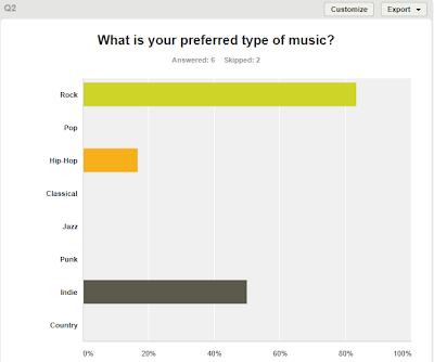
When asked what their favourite music was, most of my audience said rock, followed by indie, which works well as it is what my target genres are.
 
I asked my audience what the price of my magazine will be, and they said something between £2.00 and £2.99, which is what I was aiming for.
 
This question demonstrates a variety of answers, showing that the audience like to see reviews, interviews, tour dates etc.
This question demonstrates that the eye-catching aspects of a magazine that grab the audiences attention are whats inside, and the focus of the magazine.
The audience said how the most important aspects are whats inside and whats on the cover, as oppose to giveaways.
This question showed various answers which I will take into consideration - however most popular being upcoming bands, which is what I was going to focus on anyway.
The type of giveaways people would like to see are CDs made by the magazine and posters, and I intended to use posters.

FLATPLANS

By using Photoshop, I created flatplans for my front cover, contents page and double page spread. The image above demonstrates what I aim my front cover to look like. The masthead would be across the top of the publication, so that it is clear and straightforward. I don't want my front cover to be overcrowded, so I will apply my coverlines to the sides of the magazine, in a smaller font than the masthead, but still large enough to read and notice. The main image will cover most of the magazine cover, I may cut around it so it has no background, however depending on how it looks, I may keep the background and use it as the full front cover background. I would like my image to be black and white, however I will have to see what this looks like first; it may change. Essential information will be placed in the bottom right hand corner (such as the barcode/date/etc), as this is where this is usually found.


This is a flatplan of my contents page. I will have the masthead at the top of the page, followed by the list of pages below it. I will make sure to add page numbers and have an expected amount of pages (e.g, 80-100, rather than just 20-30). There will be a main image on the left hand side which the text may help align - for example, the first page may go up to the models head, and then stop, and then the same with the shoulders, etc - giving almost an outline. The main image would have a quote going across it from the model/singer and across the bottom of the magazine there will be options to subscribe/get weekly issues, although this may change to something more interesting/different like an Editor's letter, depending on how it looks.
 
 
This flatplan demonstrates my double page spread interview with the focused artist. Across the top of the pages, there will be a pull quote taken from the interview which will be used as the masthead - to intruige the reader but to also make the reader aware that it is a double page spread. I will have 3 columns of text, although may add another image later depending on how it looks (if there's too much text, for instance) and the font will be readable however quite small as I will take into consideration the age group of the magazines audience.

DOUBLE PAGE SPREAD DECONSTRUCTION 3


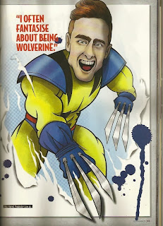
In my opinion, this is the most effective double page spread out of the 3 I have analysed. This is due to the major conventions used, but also how the magazine publication, Rocksound, have put an individual mark on the interview - specifically with the main image. The interview is focused around the lead singer from the band Don Broco, and there is a smaller image of him at the top of the interview, beside the masthead, however the second page and the high key colour scheme grabs the readers attention. Rocksound have created a graphic image of the singer and with reflecting the image with a quote, turned him into 'Wolverine'. Quote: ("I often fantasise about being Wolverine"). The quote and image are quite comical and fun, and make the interview much more interesting and engaging.
 
The interview is displayed throughout 3 columns, and unexpectedly talks about his love for superheroes and comics, as oppose to his band. This reinforces the main image but also may attract a larger audience - for instance, fans of the band would read this, but because it is not centred around their music, readers who aren't fans of the band may be interested nonetheless.
 
The interview is layed out clear and it is easy to follow. The colour scheme is brightly coloured, mostly red, white and yellow, but some blue in the main image. The red and white contrast eachother and the yellow can be used to attract attention or highlight specific parts. The red text is the question asked by the interviewer, and the black text (which also contrasts to red/white/yellow) is the singers answer. Some of his answers are highlighted in yellow, this may be simply to add another contrasting colour but it may be used to highlight certain questions.  The only aspect of the interview that focuses on the band as a whole is in the bottom right corner, which tells us that Don Broco's new single "Do I wanna know" is out now, as well as information about gig tickets.
 
The strapline is used to sum up the interview and give a brief overview, so this one talks about superheroes and how his life isn't just "black and white" - engaging the reader and again, making the interview sound much more interesting and less monotonous than the typical band interview about gigs and new singles.
 
I think this is the most successful double page spread due to the contrasting colours and how it isn't typical and boring. It interests the reader as it is giving another side to the singer - talking more about hobbies and interests than music. Although if it was an interview with the whole band, it is likely that it would be based around music and albums etc.

DOUBLE PAGE SPREAD DECONSTRUCTION 2


This double page spread has graphology which demonstrates a main image, strap line, text colomn and masthead. The main image is spread across the two pages and displays a photograph of the band, Mallory Knox.

Unlike other double page spread interviews, this one does not start with a dropcap. Instead, it uses subtitles or subheadings to almost catergorise the aspects of the interview; this may make it easier for the reader as the columns are summed up. The colour scheme is varied, as it has a fading effect. For instance, the masthead fades from red to yellow, and the background fades from dark into green. This connotes a new, fresh effect which reflects this new and upcoming band. The colour red is repeated again for the subheading, to highlight part of the strapline, but also through the clothing worn by 2 of the band members.

The text varies from white to black, depening on the colour of the background, so that the reader can still make out what it says. For instance, the strapline in white is against a dark colour whereas the black text of the interview is against a lighter green background. If these colours were swapped, the text would be unclear and difficult to read.

The main image is spread across both pages, so that the image can be enlarged but also so it dominates the page. The camera angle is tilted slightly upwards, to portray power over the new band - possible potential, for example - and to show clearly who the band are.

The first column of the interview includes a rhetorical question - immediately engaging the reader and making them think, as if involving them. Similarly, the strapline makes the reader want to continue finding out about this band due to the enthusiasm about the way they've played "mainstage" at festivals and have sold "thousands" of albums. Furthermore, Rocksound mention how this is their first cover feature interview with Mallory Knox, which may make fans of the band purchase the publication and attract more readers. It may also make current readers find interest in the band, as they are a similar genre to the focus of the magazine. The strapline pretty much sums up 2013 for Mallory Knox, letting fans and readers of the magazine have an insight as to their success and progress and what they may achieve throughout the next year.

Thursday, 28 November 2013

INSTITUTIONAL RESEARCH

I completed some research into looking at music magazine publishers in the UK, to find one that would be similar to my magazine.

1) INSTITUTION: IPC MEDIA.
    DETAILS: IPC creates content for multiple platforms: print, online, mobile, events, etc. UK's leading consumer magazine publisher. IPC Media has a range of divisions: Connect, Inspire, SouthBank, Advertising & MarketForce. It was formed in 1963.

    PUBLICATIONS: More than 60, some include: NME, Women's Weekly, Essentials, Teen Now, and Look.

2) INSTITUTION:  Bauer Media Group.
    DETAILS: Headquartered in Hamburg, Germany; operates in 16 countries worldwide. Founded in 1875.
    PUBLICATIONS: Kerrang!, Q.

3) INSTITUTION: Freeway Press
    DETAILS: Based in France. Mainly and best known for Rocksound magazine.
    PUBLICATIONS: Rocksound.

4) INSTITUION: Clash Magazine LTD.
    DETAILS: Publishes 'Clash' magazine 12 times a year. Independant publisher which has won awards, such as 'Best New Magazine' award at the PPA Magazine awards & also Music Magazine of the Year.
   PUBLICATIONS: Clash.

5) INSTITUTION: H. BAUER PUBLISHING LTD.
    DETAILS: More than 570 magazines, over 300 digital products, and 50 radio and TV stations.
    PUBLICATIONS: Mojo.

A music magazine publisher that I think would best suit my magazine would be Freeway Press, as it publishes Rocksound (Similar to my magazine) and is based in Europe.

Thursday, 21 November 2013

PHOTOSHOP

 
This is a front cover I created when learning how to use aspects of Photoshop. I didn't take time thinking about fonts and coverlines and images, however I would like my actual magazine cover to have a similar layout where the main image is slightly infront of the title. To give this effect, I zoomed in closely and erased parts of the font, to give the effect that it is behind the image. I could have done this using the quick selection tool or magic wand tool, but the colours were too similar so it was difficult. From this, I know to contrast my background and image in my actual magazine to make it easier to create this effect. I like the idea of putting a cover line that is relevant to the image over the image, like above. But like previously stated, I would put more thought into fonts and colours. I added text by using the text tool on photoshop, however had to upload the images and also change the resolution - so when printed, the quality of the images remains clear. Like the above, it is likely that I will place essential information like the barcode in the bottom corner, as this is where it is usually found.

PREVIOUS STUDENTS WORK

Looking at previous students work allowed me to gather an idea of what I should focus on and how I should present my own work when I come to produce it.

Firstly, a magazine called 'CORRUPT' looked effective and eye-catching in my opinion as the dominant image covered the masthead slightly, it had cover lines with sub-headings and it also named music artists of the genre the student had chosen. I especially liked how the font was displayed as sparkles, as I thought it was eye-catching and professional. I liked the images as there was a range of black and white and a range of colour, however the student did not specifiy clearly what kind of magazine they had made - for example, they used titles such as 'FASHION' and 'NEWS' which makes me think it was not focused completely around music. In contrast to this, I especially liked how the student had manipulated tweets from the social networking site Twitter to make it look as though people had bought and enjoyed her magazine.

Another magazine I looked at I didn't find very appealing as it was very confusing and unclear. For example, the masthead was not the biggest text on the front cover, so it was confusing to try to work out what the magazine was called. In comparison to 'CORRUPT', where the student had used a smaller text for everything else on the page, like coverlines - I think this works better as it is clearer. The student who created this second magazine also didn't specify clearly what the magazine was based around, the terminology used, such as 'genre' indicated a music magazine, but unlike 'CORRUPT' where the model was holding a guitar on the front cover, there was no specifying what it was based around. As well as this, essential information (particularly the barcode) was extremely oversized and took up more space than necessary.

A magazine that I particularly liked called 'IMAGE' was very similar to 'CORRUPT', except was the opposite in genre. I liked this magazine as it was similar to Q magazine in the way it was layed out - it was clear, had a dominant image, essential information, coverlines, and demonstrated what kind of music magazine it was. The only part I would have improved on was the contents page, as it was very spaced out and bare - unlike the front cover which in my opinion looked professional.

From what I have learned by looking at previous students work, the magazine 'CORRUPT' inspired me most. It looked very professional, had a basic but effective colour scheme - especially with the selective colouring - and the text was clear and well presented. I will take most of my inspiration from simple but effective magazines like this one, as oppose to magazines with too much colouring, almost unreadable fonts, blurry images and a complicated layout.

AS COURSEWORK PROPOSAL TABLE – STAGE 2

IDEA FOR THE BRIEF
My magazine will be a music magazine based around the rock/alternative/post-hardcore genre. It will be aimed at ages 16-30 (reasons listed below) and will highlight interviews with bands, upcoming bands, local bands, festivals, concerts, giveaways, new albums and new singles.
GENRE/SUB GENRE
The genre of my magazine will be based around and focused mainly on alternative/rock/post-hardcore music. here, you can gather an idea of the bands/artists that my magazine would include. I chose this genre as it is the music that influences me most, so it would be more relative for me and I would know what artists etc to include.


TARGET AUDIENCE
My target audience will be roughly ages 16-30, both male and female. I chose the age group based on the genre of my magazine but also the possible explicit language that may be used (due to the genre). Both male and female readers would appeal to my magazine, as long as they were interested in the genre, and the target audience would all have similar characteristics. Those who enjoy attending festivals such as Reading/Leeds, Download, Slam Dunk etc and who enjoy seeing bands live in music venues would take more interest in my magazine than those who don't. I have taken this into consideration, and therefore my magazine will have a lot of information about upcoming festivals, concerts and musicians. 


MAJOR CONVENTIONS
I will use major conventions such as a masthead, coverlines, dominant images, essential information, selling points, strap lines and drop caps. As well as these, I will organise possible interviews with musicians into no more than three columns, so that it is easy to read, steadily paced and layed out carefully. I will make sure to give my images captions, to give anchorage to the reader, and make all of my conventions link and be relevant to one another, so that there are no out of place aspects - this would make my magazine look more well presented and realistic.

IMAGES
I don't want to use too many images in my magazine, especially not on the cover or contents page, as I think this would make the magazine seem crowded and unclear. On the front cover, I will have one main image that could work as a background - with text and other information layered on top. On the contents page I will have no more than 4 images, as again, I don't want the magazine to be crowded or confusing. During a double page spread, it is likely that I will have columns of text, with a few images for anchorage. This would include a dominant image, and 2-3 smaller, relevant images. I will be using low key lighting with my photographs to fit the genre; bright lighting would not be suitable or relevant. It is possible that I would use selective colouring on black and white images to reinforce the genre but also make the magazine look more presentable. I can create low key lighting by using a black background rather than a white, and by using a soft box/flash lights for specific lighting/shadows.

POTENTIAL DIFFICULTIES
I think that working with programmes such as Photoshop will make it difficult for me to create my magazine to full potential, as although used to it, it can be tricky and complicated. Similarly, taking photographs of the model may not go well as the model may not be able to find the time to allow me to photograph them or we may not be able to find a time slot where I could photograph her the best possible way - (studios may be closed or in use, etc).

Friday, 15 November 2013

AS COURSEWORK PROPOSAL TABLE – STAGE 1

TYPE OF MAGAZINE
The magazine that I plan to create will be a music magazine based around the hardcore/pop punk/alternative/rock genre. 

NAME OF MAGAZINE
I have not decided upon a title yet, however I aim for it to be something relative to the genre of music. 

AUDIENCE
My magazine will be for anybody who listens to the style of music, male or female.

AUDIENCE (ATTITUDES & INTERESTS)
The magazine will include aspects such as tour dates, giveaways, interviews with bands. So the audience would be people who go to concerts and very much enjoy music. 

OUTLET
The magazine would be available in supermarkets, news agencies and online.

NECESSARY INFORMATION
This would include the date of the weekly issue, the issue number, the bar code, etc

SELLING POINT
As a selling point, my magazine may include giveaways and competitions - the ability to win tickets to concerts, or even free CD's etc.

THEME
The theme of the magazine will be an interview with a new artist.

IMAGES FRONT COVER
The dominant image on the cover will be centre placed and reflective of the genre - it may include a microphone, relevant colour scheme etc.

IMAGES INSIDE
Images inside will not be as important as the main image on the cover, however they would still be relevant to the article and I would not use so many that it would take away attention from the text (Maximum of 4)

Thursday, 14 November 2013

DOUBLE PAGE SPREAD DECONSTRUCTION 1


This double page spread from NME magazine focuses on the band 'White Lies'. Firstly, it demonstrates that this band would fit the typical genre of NME magazine as an 'indie' band  thoroughly due to the colours used - especially in the image itself. The dark purple underlining of the article title against the dirty white background reflects the common colours in this magazine - low key, dark and almost dull. NME magazine does not use bright colours often, as this simply would not reflect the focused genre of the magazine. The composition of this dominant image has the three band members in low key lighting, with specific spotlights ('limited colour palette'). The spotlights create shadow in the image and may be used to reflect how this particular band are currently in the spotlight of their genre - for example they may have released a new song, album etc which is causing them to gain attention and popularity. The image has a caption which is used to give anchorage to the audience - in this case, the names of the band members. 

The article title, which is a pull quote from the interview, is highlighted to engage the reader. "We Want Kings Of Leon's Career" pulls the audience in as they may be intrigued to read more about this less known band, who are aiming high. In addition to this, the title would also grab the attention of Kings of Leon fans, which due to the genre of the magazine, would be high. To reinforce this even further, this is the boldest part of the double page spread, capitalised and underlined. 

Below the article title, we see the strap-line, which adds information to the title. There are only two other aspects of the article highlighted in purple, these being the name of the band and the interviewers name; this is used to aid the audience with an understanding of what the article will include. In this case, the almost comical strap line explains "Their Mission" and "Their Message", this fun way of explaining what the band are up to would draw the audience in rather than a typical and boring explanation. 

A drop cap is used at the beginning of the interview to demonstrate to the reader where the text begins. I think this drop cap specifically engages the reader more than others, as usually the drop cap would be a letter, in this case it is the number 4, as the article starts differently with a time as oppose to the band name or typical opening lexis. Before discussing Kings of Leon and their career, the interviewer states a little about the bands songs and previous album, which would further engage fans of the band to read on. The density of the text is kept to two columns on this page, to give the reader an introduction but to not say too much straight away. Similarly, the pace of the text flows and is easy to read, and the register is aimed at the audience and is compatible with the age group - informal yet informative, with comical aspects and an easy pace. 

Tuesday, 22 October 2013

Preliminary Task Front Cover & Contents Page

Using Publisher, I created a magazine cover and contents page based on a college magazine.


I recieved feedback from this task that stated both positive and negative comments. Firstly, the use of appropriate and varied images worked well, although the quality of them could be improved. Similarly, I used evidence of key conventions such as the masthead, barcode, coverlines etc. In regards to improvements I could make, I agree with the fact that the colours and fonts are quite dull and boring, and the major spelling area in the masthead demonstrates how I need to take more care in producing my final magazine. The contents page is also quite bare, which is another aspect I will take into consideration. When I create my actual magazine, I will have a lot more time to produce it, so it should look much more professional. I only had 90 minutes to create this magazine, including taking and uploading images. When I create my actual magazine, I will have much more time.

Thursday, 10 October 2013

MOOD BOARD


This is an image I created by using a mosaic tool on a website called BigHugeLabs, through this I can demonstrate bands I may use in my magazine.

CONTENTS PAGE DECONSTRUCTIONS


I created a presentation on Microsoft Powerpoint to demonstrate a contents page analysis. I then uploaded it to the website SlideShare so that I could embed it into my coursework.


CONTENTS PAGE FLATPLAN

 
I am using another main image on the contents page for a visual aspect, this way I can avoid everything just being in writing. Again, the image may have a quote layered on top of it, or even another page number (The page number that would be on the image, would be the relevant page number to the band/artist the picture is taken of).
 
The contents page information and page numbers would be placed to the left of the main image below the masthead, in the same contrasting colours used on the front cover. A subscription box would be found at the bottom of the contents page to pursuade the reader into subscribing and why they should. The background of this would likely be white so that the black writing contrasts making it easier to read.

COVER FLATPLAN


I placed the masthead at the top of the magazine cover so that it is the first thing the reader would notice, therefore they would recognise the company and what genre it focuses around. I would make the masthead bold, and a contrasting colour to the rest of the cover, so that it is prominent and noticeable, and not hidden by other aspects of the cover.

The main image would be in black and white, as they are contrasting colours, and it would be placed between the masthead and the coverlines/selling points at the bottom. It may be layered with quotes and other coverlines however they would be in a contrasting colour so they'd be easy to read. The main image would fit the genre and reflect the style of music so that it is relevant and so the reader may recognise the band/artist.

I would place more coverlines at the bottom of the magazine front cover with a plain background (e.g plain black with white writing) so that they stood out and were easily readable. I would place the bar code, date & issue number etc in the bottom right of the cover as this is where they are commonly found.

Thursday, 3 October 2013

INSPIRATIONAL TEXTS


I completed some research into the types of music I want my magazine to be focused on. I concluded that the genre will be post/hardcore, pop punk, and also focused on unreleased hardcore bands.


FRONT COVER DECONSTRUCTION 3

Firstly, the masthead, 'Q', stands out greatly against the main image of the magazine cover, which is used as a background in this case. The masthead is bold and has contrasting colours (red & white) so that it catches the eye immediately. The main image, Florence Welch from Florence & The Machine, is used as a vibrant background and a hint of the main focus of this particular issue. The gripping coverline - "Woman on the edge" and a quote from the artist - "I feel so alone" - is used to show how the magazine may include an intense/personal interview with Florence which would have fans of the artist wanting to know more.

In regards to the colour scheme, it is kept to a minumum of red, blue and white. The red is obviously caused by the artist's hair, however works well as it contrasts to the much bolder red used to make the masthead stand out, reinforcing it further. Coverlines are wrote in white, to make them stand out against the red of her hair, and also to match the other colours, so there is no awful clashes which would take attention away from what it actually says. Blue colouring is used in minor aspects of the cover, such as bulletpoints and to seperate different coverlines etc. There is a specific part of the cover regarding the Radio 1 DJ, Zane Lowe, which has a blue highlight around it, possibly to appeal to audiences of the alternative/indie genre of the music he plays on his radio show, and also audiences of the magazine. It is evident that the colours have been chosen for a specific reason, as the artist in the main image has blue eyeshadow to highlight her eyes - linking with the other blue aspects of the cover.

The coverlines are used in an intelligent and gripping way - to create an idea of what the magazine will entail, but to also allow the audience to use their imagination as to what it may mean. For example, "SKRILLEX - Dance genius or noisy git?" as well as humouring the audience, this coverline demonstrates that the article may portray two different opinions, which can also attract a larger audience - those who hate Skrillex, and those who are a fan. Similarly, '16 page gig blow-out!" is used as a selling point as it shows how the magazine will focus a lot on upcoming gigs, which would appeal to the whole audience as they would all be interested in music/live shows.

FRONT COVER DECONSTRUCTION 2

This magazine focuses around the heavy, post-hardcore genre. This is evident due to main elements such as the main image, coverlines, fonts and colour scheme.

Firstly, the main image is shown layered over the masthead, as well as props in the main image being a loud speaker and brick, and the various bands (BMTH, You Me At Six, The Blackout etc) have facial expressions that connote anger and loud music - all of these features demonstrate the 'in your face', heavy music that the magazine publishes. You can still see the masthead, due to the white colouring, which contrasts to the dark colours of the main image. Colours have been kept to minimum low key themes, with occasional phrases coloured yellow, to draw attention. For instance, 'Posters' has been created yellow to draw the audiences attention to this particular selling point. 'Plus' is also yellow, to demonstrate the coverlines which show what else is included in the magazine. Instead of going into slight depth about interviews and tour dates, the coverlines are simply just names of bands, such as 'Alesana', 'You Me At Six' and 'We Are The Ocean' - this is used efficiently to quickly give the audience an insight so they can see if bands of their interest will be included in the issue. It also gives a sense of genre as they again, are all quite heavy bands. The final point in yellow, is 'Brits on the Rampage', this makes one assume that the audience is aimed at younger people, due to the slang tone of the word 'Rampage' and the shortening of 'Brits'.

The fonts on this cover are made easy to read and stand out. 'We Predict A Riot' is written in upper case lettering which may reinforce the loud music scene, and it also has a smashed glass effect to it, provoking and connoting violence within the scene. With this idea in mind, the artist in the bottom left is holding a brick, which furthermore connotes violence.

Thursday, 26 September 2013

FRONT COVER DECONSTRUCTION 1


The masthead is usually the largest text on the page, and it commonly stands out against the rest of the cover, in this case, some colours are repeated and the masthead, 'NME' is the same size as the main focus of the cover, which is the artist 'Jake Bugg'. The masthead is an acronym for 'New Musical Express' - this may make the magazine more appealing as it is easier to read and remember and doesn't take excessive amounts of attention away from the rest of the cover. It reflects what the magazine denotes, and the red stands out greatly against the black and white/yellow colouring, catching the audiences attention.

As well as colours in the masthead, the rest of the cover shows a repeating and effective colour scheme. Colours are important in magazine covers as they have to be relevant to the age group and genre of the magazine. In this case, the red parts are shown as more important as they stand out most compared to the more low key colours. The red parts demonstrate the most important parts as the artist that the magazine has focused itself around, the title, a competition for concert tickets, and unseen pictures of Nirvana, this is used to attract the specific audiences interested in the genre. Also the Nirvana part has been used as a main selling point, the use of the words 'exclusive' and 'unseen' make the audience intruiged to see these things that apparently nobody else has before, and because Nirvana are quite an iconic band, this point is emphasised more. The magazine does not publish too many articles/giveaways in red, as they want to keep it to a minumum to make it more noticeable. If lots of details were red, it would take away the fact there is only certain main focuses.

The coverlines on this cover are used to show contents of what is also in the magazine, without attracting too much attention away from the main focuses and without taking up too much space on the cover. They are commonly found at the sides of magazines and are smaller than the masthead. They are relevant but kept too a minimum. In this case, the coverlines are interviews with other artists in the genre which would attract the audience further.

'The 18-year old enemy of the X Factor' may appeal to audiences of NME as the magazine is aimed at more indie music, which is the opposite of what the X Factor represents. This is white to stand out against the main image. After this, it says 'hits America with Noel Gallagher' - Noel Gallagher is printed in yellow to make it stand out further against the white and black, this contrast would attract audiences of Noel Gallagher/his projects/music, which I assume would be a great majority of readers of this genre, and therefore the may be attracted into purchasing the magazine more to find out about Jake Bugg and how an upcoming artist can be linked to an artist of a more famous position so early in their career.

Thursday, 19 September 2013

KEY FEATURES OF A MAGAZINE COVER


MASTHEAD - Title of the magazine - demonstrates name of publication.
MAIN COVERLINE - Also called 'sell lines', they are usually no more than 5 words and are a quick summary of the contents of the magazine.
BAR CODE/PRICE/DATE - Essential information for both the buyer and seller.
MAIN IMAGE - To display that the band Enter Shikari are the main focus of the magazine - this may demonstrate to the audience that this particular band have a large interview/role in the contents of the publication.
COVERLINES - Not as important as the main coverline, these act as small indications of the contents of the publication (what else is found inside)

Tuesday, 10 September 2013

PRINT BRIEF

Print Brief

I will complete two linked tasks. The set brief is as follows:

Preliminary exercise: using DTP and an image manipulation program, produce the front page of a new school/college magazine, featuring a photograph of a student in medium close-up plus some appropriately laid-out text and a masthead. Additionally I will produce a mock-up of the layout of the contents page to demonstrate your grasp of DTP.

Main task: the front page, contents and double page spread of a new music magazine (if done as a group task, each member of the group must produce an individual edition of the magazine, following the same house style).