
Thursday, 6 March 2014
PHOTOSHOP PROGRESS 6/3/14
Friday, 28 February 2014
PHOTOSHOP PROGRESS 28/2/14

The font I have drawn almost looks as though it is dripping, and has a slime effect, I drew it this way to fit the genre of the magazine and make it different to other mastheads on other magazines.
Friday, 14 February 2014
PHOTOSHOP PROGRESS 14/2/2014
This week, I created my double page spread.
 To begin with, I wanted to choose a sort of theme for the article, so I chose science, space, and what Ellen studied in school/college. This linked to the masthead 'I wanted to be an astronaut...' and how this is a pull quote from the article, similarly, I used a pun/joke as the tagline, 'The singer who wanted to be on top of the world - now she's on top of the charts!' I kept the colour scheme quite simple, with dark red (to match her dress), black and white. After writing the article, it became apparent that there was large white space that I wanted to get rid of, so I placed a heart there, by using 'custom shapes'. I also added an outer glow, to link it to the outer glow on 'astronaut. To finish off, I added a page number and a box at the bottom to give information about the album and release date. I plan on starting my front cover as soon as possible.
Tuesday, 4 February 2014
PHOTOSHOP PROGRESS 04/02/2014

I began with the photo I am using for my double page spread. I used the quick selection tool to cut around the model and to delete the background, however once the background was gone, you could still see gaps of it through the hair. To resolve this, first I tried to use the magic wand tool/quick selection tool to delete it, however the flicks of hair you can see in the image beside the blue gaps looked strange, so I used a youtube tutorial to find out how I can make the hair look realistic however so the background was gone. Here is the youtube tutorial. Once the hair was smooth enough so that it still looked realistic, I used the eraser tool to erase the hair that is seen flicking out at the side beside the background gaps. You can see this in the finished edit:

Tuesday, 28 January 2014
COLOUR PALETTE

The middle colours demonstrate different shades of red that I will consider using for my magzine. In the images, the model is wearing a red/burgandy dress, so the colours may match. If I want the colours to match completely, I could use the colour picker tool on Photoshop so that I can use the exact colour of the text on the double page spread, alongside the dress. It is likely that I would use the first colour, as the other two are rather bright and the last is quite pastel. It is most likely that I will use the colour of the models dress.
The last line is possible text colour, if I didn't want to use black. E.G, for coverlines on the front cover, as I wouldn't be able to have black text on a black background. I like the middle option mostly as it isn't too dark however isn't completely white, so if it was beside white text there would be a slight contrasting difference.
Thursday, 16 January 2014
FONTS
I am going to sample and explore a variety of fonts to see which one would work well in regards to coverlines and subheadings etc. I plan to draw my masthead and later scan it and apply Photoshop work to it to make it a more original font, however still need a style for basic text.

The font above demonstrates Helvetica, which I think would work well especially for the double page spread/interview as it is easy to read and understand. It's simple and is used regularly by other publications.
 This example is Century Gothic. I like this font as it's simple and easy to read, although it looks slightly informal, I don't think it would look successful in large quantity on a double page spread or a contents page.
 The above example is called Adobe Fan Heiti and I think it's almost a middleground between Century Gothic and Helvetica - it's formal and also informal, but not too much of either. It is likely that I would use this font in my magazine on either the double page spread or contents page.
 This is an example of a font that I think would be far too formal for my magazine, due to the audience target age and also genre. It's far more formal than all of the ones above and wouldn't likely be used in a music magazine.


The font above demonstrates Helvetica, which I think would work well especially for the double page spread/interview as it is easy to read and understand. It's simple and is used regularly by other publications.


I think this font, Showcard Gothic, is much too informal to use in my magazine, as in large quantity I think it would be quite difficult to read, and also due to how bold it is it would take away the audience's attention from other aspects of the page.

I don't want to use a font such as this one (Lucinda Handwriting) because I think a handwritten/calligraphy font would be too informal and distracting, and it may also be very difficult to read. I think a printed font such as the first few I demonstrated would work much better.
Thursday, 9 January 2014
PHOTOS FOR MY MAGAZINE
When taking photos, I conducted 2 photography shoots. The first was an outdoors shoot and the second was an indoor shoot. Through the outdoor shoot, I have created a front cover image, seen below:


I imagine this image cut out from the background using Photoshop, with a black background and limited colour palette - colours such as red, black and white will be used. I may increase the brightness and contrast of this image so that the eye makeup/lips and hair/skin stand out against eachother.
The image below is one that I was going to use for the front cover, however instead may use for the contents page/double page spread. The reason I changed it is because I think the image above displays the genre more, as it is darker and the model is looking away, I think it looks more professional.
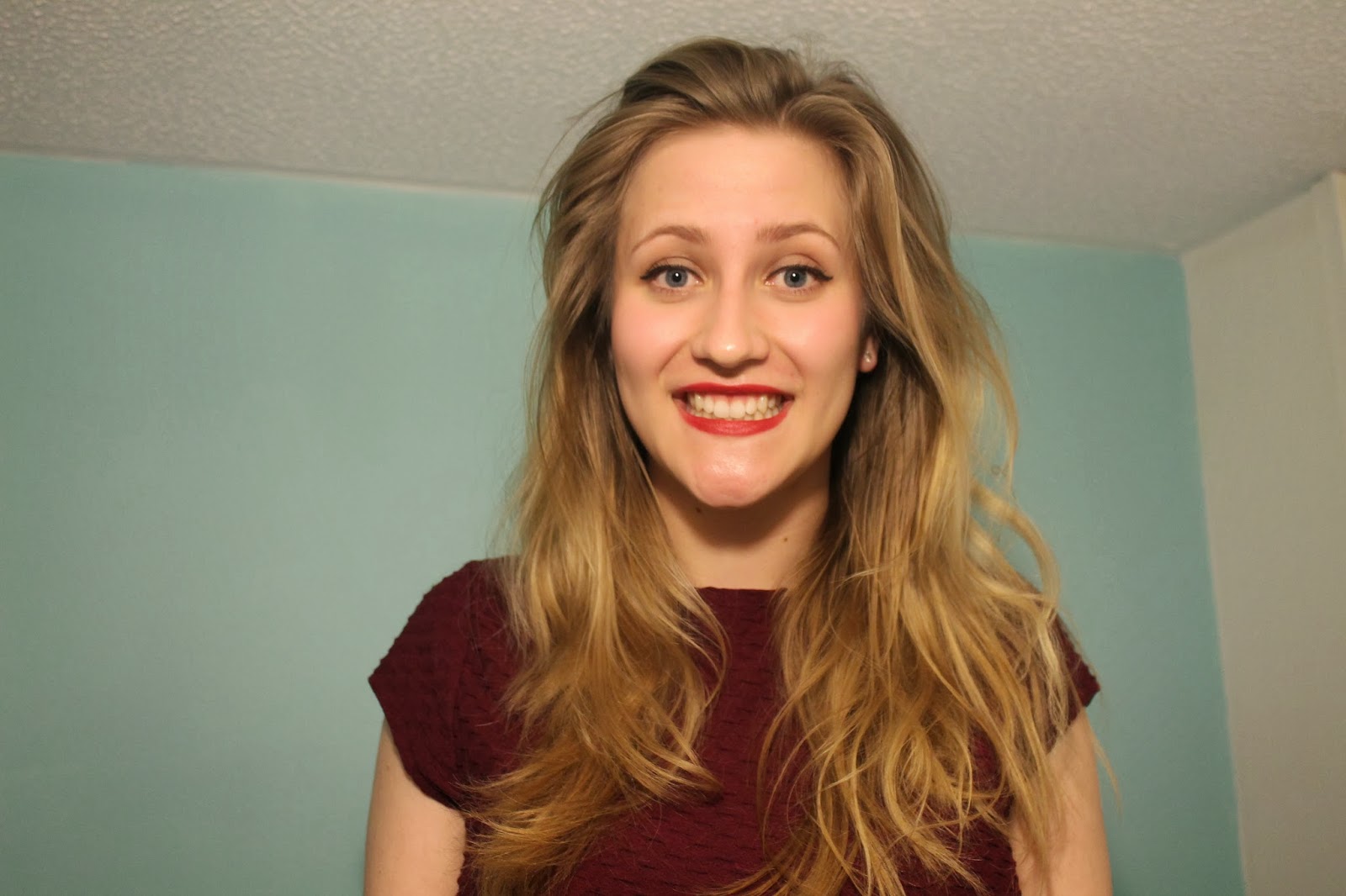
I think again I may cut this image from the background and possibly turn the image black and white and use selective colour to highlight the red aspects, as these are my main focus colours. I also like how you can decipher that these are from different shoots, which seems professional as there is variety.

I wanted a vertical image for my double page spread, so that it could be in line with the text colums, so I may cut out this image from the background and use this one. However, because it is a midshot and her hands arent shown, I will have to put something infront of her such as a quote or banner/subheading so that it doesn't look strange/out of place.

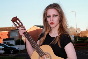
This is an image that I thought I was going to use, however when thinking about how it will look in my magazine, I think it will look 'cheesy' and unprofessional, and therefore will not involve it. I liked this shoot as the model had a guitar, which signified music and allowed the audience to decipher the genre of my magazine, however I can resolve this problem by adding symbols to the cover such as a musical note beside the masthead.
Subscribe to:
Posts (Atom)