Thursday, 12 December 2013

AUDIENCE RESEARCH


I created a survey by using SurveyMonkey.com and this allowed me to gather audience research to help in the making of my music magazine.

The first question was just simply asking the audience how often they read magazines, most people said monthly, which would influence me to make my magazine maybe an every week or maybe every two week publication, as if it was daily, it may not sell continuously; nobody who participated in my survey said they read magazines daily.
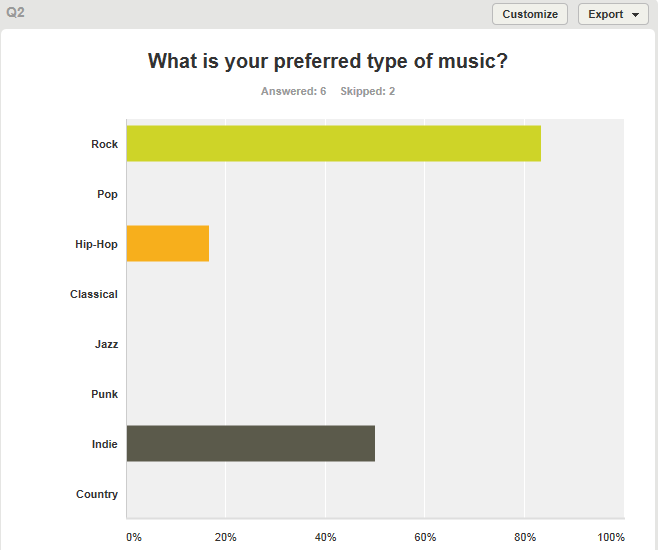
When asked what their favourite music was, most of my audience said rock, followed by indie, which works well as it is what my target genres are.
 
I asked my audience what the price of my magazine will be, and they said something between £2.00 and £2.99, which is what I was aiming for.
 
This question demonstrates a variety of answers, showing that the audience like to see reviews, interviews, tour dates etc.
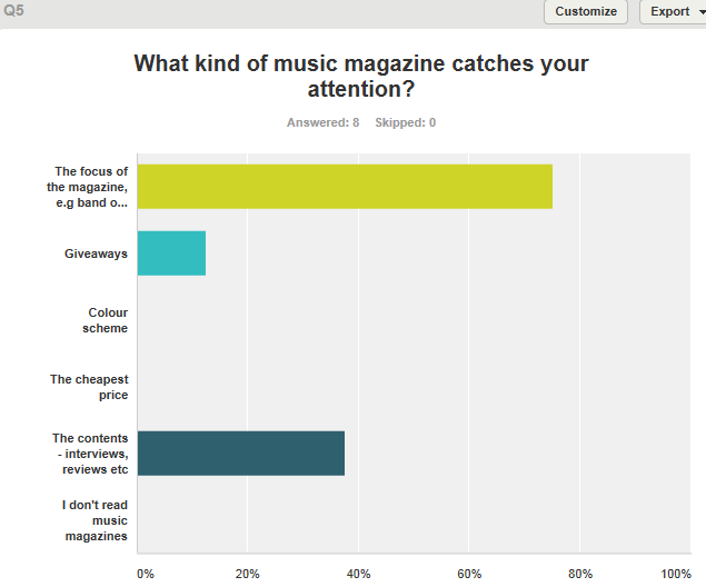
This question demonstrates that the eye-catching aspects of a magazine that grab the audiences attention are whats inside, and the focus of the magazine.
The audience said how the most important aspects are whats inside and whats on the cover, as oppose to giveaways.
This question showed various answers which I will take into consideration - however most popular being upcoming bands, which is what I was going to focus on anyway.
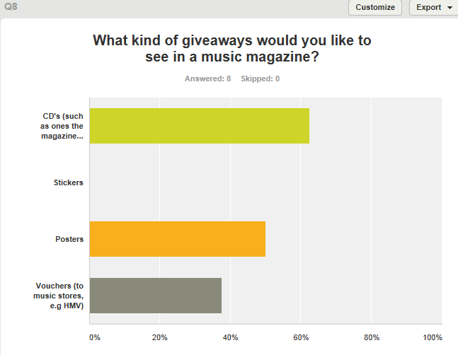
The type of giveaways people would like to see are CDs made by the magazine and posters, and I intended to use posters.

FLATPLANS

By using Photoshop, I created flatplans for my front cover, contents page and double page spread. The image above demonstrates what I aim my front cover to look like. The masthead would be across the top of the publication, so that it is clear and straightforward. I don't want my front cover to be overcrowded, so I will apply my coverlines to the sides of the magazine, in a smaller font than the masthead, but still large enough to read and notice. The main image will cover most of the magazine cover, I may cut around it so it has no background, however depending on how it looks, I may keep the background and use it as the full front cover background. I would like my image to be black and white, however I will have to see what this looks like first; it may change. Essential information will be placed in the bottom right hand corner (such as the barcode/date/etc), as this is where this is usually found.


This is a flatplan of my contents page. I will have the masthead at the top of the page, followed by the list of pages below it. I will make sure to add page numbers and have an expected amount of pages (e.g, 80-100, rather than just 20-30). There will be a main image on the left hand side which the text may help align - for example, the first page may go up to the models head, and then stop, and then the same with the shoulders, etc - giving almost an outline. The main image would have a quote going across it from the model/singer and across the bottom of the magazine there will be options to subscribe/get weekly issues, although this may change to something more interesting/different like an Editor's letter, depending on how it looks.
 
 
This flatplan demonstrates my double page spread interview with the focused artist. Across the top of the pages, there will be a pull quote taken from the interview which will be used as the masthead - to intruige the reader but to also make the reader aware that it is a double page spread. I will have 3 columns of text, although may add another image later depending on how it looks (if there's too much text, for instance) and the font will be readable however quite small as I will take into consideration the age group of the magazines audience.

DOUBLE PAGE SPREAD DECONSTRUCTION 3


In my opinion, this is the most effective double page spread out of the 3 I have analysed. This is due to the major conventions used, but also how the magazine publication, Rocksound, have put an individual mark on the interview - specifically with the main image. The interview is focused around the lead singer from the band Don Broco, and there is a smaller image of him at the top of the interview, beside the masthead, however the second page and the high key colour scheme grabs the readers attention. Rocksound have created a graphic image of the singer and with reflecting the image with a quote, turned him into 'Wolverine'. Quote: ("I often fantasise about being Wolverine"). The quote and image are quite comical and fun, and make the interview much more interesting and engaging.
 
The interview is displayed throughout 3 columns, and unexpectedly talks about his love for superheroes and comics, as oppose to his band. This reinforces the main image but also may attract a larger audience - for instance, fans of the band would read this, but because it is not centred around their music, readers who aren't fans of the band may be interested nonetheless.
 
The interview is layed out clear and it is easy to follow. The colour scheme is brightly coloured, mostly red, white and yellow, but some blue in the main image. The red and white contrast eachother and the yellow can be used to attract attention or highlight specific parts. The red text is the question asked by the interviewer, and the black text (which also contrasts to red/white/yellow) is the singers answer. Some of his answers are highlighted in yellow, this may be simply to add another contrasting colour but it may be used to highlight certain questions.  The only aspect of the interview that focuses on the band as a whole is in the bottom right corner, which tells us that Don Broco's new single "Do I wanna know" is out now, as well as information about gig tickets.
 
The strapline is used to sum up the interview and give a brief overview, so this one talks about superheroes and how his life isn't just "black and white" - engaging the reader and again, making the interview sound much more interesting and less monotonous than the typical band interview about gigs and new singles.
 
I think this is the most successful double page spread due to the contrasting colours and how it isn't typical and boring. It interests the reader as it is giving another side to the singer - talking more about hobbies and interests than music. Although if it was an interview with the whole band, it is likely that it would be based around music and albums etc.

DOUBLE PAGE SPREAD DECONSTRUCTION 2


This double page spread has graphology which demonstrates a main image, strap line, text colomn and masthead. The main image is spread across the two pages and displays a photograph of the band, Mallory Knox.

Unlike other double page spread interviews, this one does not start with a dropcap. Instead, it uses subtitles or subheadings to almost catergorise the aspects of the interview; this may make it easier for the reader as the columns are summed up. The colour scheme is varied, as it has a fading effect. For instance, the masthead fades from red to yellow, and the background fades from dark into green. This connotes a new, fresh effect which reflects this new and upcoming band. The colour red is repeated again for the subheading, to highlight part of the strapline, but also through the clothing worn by 2 of the band members.

The text varies from white to black, depening on the colour of the background, so that the reader can still make out what it says. For instance, the strapline in white is against a dark colour whereas the black text of the interview is against a lighter green background. If these colours were swapped, the text would be unclear and difficult to read.

The main image is spread across both pages, so that the image can be enlarged but also so it dominates the page. The camera angle is tilted slightly upwards, to portray power over the new band - possible potential, for example - and to show clearly who the band are.

The first column of the interview includes a rhetorical question - immediately engaging the reader and making them think, as if involving them. Similarly, the strapline makes the reader want to continue finding out about this band due to the enthusiasm about the way they've played "mainstage" at festivals and have sold "thousands" of albums. Furthermore, Rocksound mention how this is their first cover feature interview with Mallory Knox, which may make fans of the band purchase the publication and attract more readers. It may also make current readers find interest in the band, as they are a similar genre to the focus of the magazine. The strapline pretty much sums up 2013 for Mallory Knox, letting fans and readers of the magazine have an insight as to their success and progress and what they may achieve throughout the next year.

Thursday, 28 November 2013

INSTITUTIONAL RESEARCH

I completed some research into looking at music magazine publishers in the UK, to find one that would be similar to my magazine.

1) INSTITUTION: IPC MEDIA.
    DETAILS: IPC creates content for multiple platforms: print, online, mobile, events, etc. UK's leading consumer magazine publisher. IPC Media has a range of divisions: Connect, Inspire, SouthBank, Advertising & MarketForce. It was formed in 1963.

    PUBLICATIONS: More than 60, some include: NME, Women's Weekly, Essentials, Teen Now, and Look.

2) INSTITUTION:  Bauer Media Group.
    DETAILS: Headquartered in Hamburg, Germany; operates in 16 countries worldwide. Founded in 1875.
    PUBLICATIONS: Kerrang!, Q.

3) INSTITUTION: Freeway Press
    DETAILS: Based in France. Mainly and best known for Rocksound magazine.
    PUBLICATIONS: Rocksound.

4) INSTITUION: Clash Magazine LTD.
    DETAILS: Publishes 'Clash' magazine 12 times a year. Independant publisher which has won awards, such as 'Best New Magazine' award at the PPA Magazine awards & also Music Magazine of the Year.
   PUBLICATIONS: Clash.

5) INSTITUTION: H. BAUER PUBLISHING LTD.
    DETAILS: More than 570 magazines, over 300 digital products, and 50 radio and TV stations.
    PUBLICATIONS: Mojo.

A music magazine publisher that I think would best suit my magazine would be Freeway Press, as it publishes Rocksound (Similar to my magazine) and is based in Europe.

Thursday, 21 November 2013

PHOTOSHOP

 
This is a front cover I created when learning how to use aspects of Photoshop. I didn't take time thinking about fonts and coverlines and images, however I would like my actual magazine cover to have a similar layout where the main image is slightly infront of the title. To give this effect, I zoomed in closely and erased parts of the font, to give the effect that it is behind the image. I could have done this using the quick selection tool or magic wand tool, but the colours were too similar so it was difficult. From this, I know to contrast my background and image in my actual magazine to make it easier to create this effect. I like the idea of putting a cover line that is relevant to the image over the image, like above. But like previously stated, I would put more thought into fonts and colours. I added text by using the text tool on photoshop, however had to upload the images and also change the resolution - so when printed, the quality of the images remains clear. Like the above, it is likely that I will place essential information like the barcode in the bottom corner, as this is where it is usually found.

PREVIOUS STUDENTS WORK

Looking at previous students work allowed me to gather an idea of what I should focus on and how I should present my own work when I come to produce it.

Firstly, a magazine called 'CORRUPT' looked effective and eye-catching in my opinion as the dominant image covered the masthead slightly, it had cover lines with sub-headings and it also named music artists of the genre the student had chosen. I especially liked how the font was displayed as sparkles, as I thought it was eye-catching and professional. I liked the images as there was a range of black and white and a range of colour, however the student did not specifiy clearly what kind of magazine they had made - for example, they used titles such as 'FASHION' and 'NEWS' which makes me think it was not focused completely around music. In contrast to this, I especially liked how the student had manipulated tweets from the social networking site Twitter to make it look as though people had bought and enjoyed her magazine.

Another magazine I looked at I didn't find very appealing as it was very confusing and unclear. For example, the masthead was not the biggest text on the front cover, so it was confusing to try to work out what the magazine was called. In comparison to 'CORRUPT', where the student had used a smaller text for everything else on the page, like coverlines - I think this works better as it is clearer. The student who created this second magazine also didn't specify clearly what the magazine was based around, the terminology used, such as 'genre' indicated a music magazine, but unlike 'CORRUPT' where the model was holding a guitar on the front cover, there was no specifying what it was based around. As well as this, essential information (particularly the barcode) was extremely oversized and took up more space than necessary.

A magazine that I particularly liked called 'IMAGE' was very similar to 'CORRUPT', except was the opposite in genre. I liked this magazine as it was similar to Q magazine in the way it was layed out - it was clear, had a dominant image, essential information, coverlines, and demonstrated what kind of music magazine it was. The only part I would have improved on was the contents page, as it was very spaced out and bare - unlike the front cover which in my opinion looked professional.

From what I have learned by looking at previous students work, the magazine 'CORRUPT' inspired me most. It looked very professional, had a basic but effective colour scheme - especially with the selective colouring - and the text was clear and well presented. I will take most of my inspiration from simple but effective magazines like this one, as oppose to magazines with too much colouring, almost unreadable fonts, blurry images and a complicated layout.