Friday, 2 May 2014

EVALUATION QUESTION 7

I think I have learned a lot since creating the preliminary task.


Although I created this on Photoshop, it is extremely amateur and unprofessional. To begin with, the masthead on the front cover is spelled incorrectly, the photographs are not to a good quality/high standard, the text and font is repetitive and the colour scheme lacks variation. As well as this, I only had 1 hour to create this magazine and there is a lack of magazine conventions such as the price and date - the only essential piece of information is the bar code.
 
 
I also created a magazine front cover a few days later as extra Photoshop experience before creating my actual music magazine.
 
 
This front cover is slightly more professional however still very unrealistic. I think the masthead being placed behind the main image makes the magazine look professional, however the images on the cover are taken from the internet and again, the font and colours are limited. This magazine has more conventions than my preliminary task, such as the price and more coverlines, however is still not to a high standard.
 
Since creating these magazines, I have gained more Photoshop experience, learned how to take more successful photos and knowledge about working in a studio. I have also learned more about the layout and presentation of a realistic magazine and how conventions and images add to the realism of magazines. In addition, I have learned more about gathering information, opinions, mode of address and how to attract a targetted audience.

EVALUATION QUESTION 6

This is an image I created on Photoshop demonstrating the physical and digital equipment I used in the making and the research of my magazine. This includes Prezi, Slideshare, Photoshop, Blogger, Apple technologies (e.g Mac computers and my Macbook), and my DSLR Cannon 110D. I also used Youtube, scribd, a scanner, dafont and bighugelabs.  The use of technologies influence my magazine majorly, as I was able to research my audience more, produce higher quality images, edit my magazine and create it on professional software, and keep all of my coursework together on a blogging website, which helped in the organisation of my work. It also gave me the chance to hyperlink aspects together, refer back to things easily and work outside of college. I hadn't used almost all of these programmes before, so it was a learning experience as well as a helpful and more professional way of working.

EVALUATION QUESTION 5

 
I created a powerpoint to explain how I attracted and addressed my audience.


EVALUATION QUESTION 4


I created a slide-show on Prezi, including screengrabs from my survey, to display who the audience would be for my magazine.

Thursday, 1 May 2014

EVALUATION QUESTION 3


I used Microsoft Word to write up the answer to this question, and then I used Scribd.com to embed it into a blog post.

Wednesday, 30 April 2014

EVALUATION QUESTION 2

 
The particular social groups of the NME magazine and my magazine are extremely similar, so I wanted to create a similar image to those seen in NME magazine. Firstly, the composition and shots are both the same - central and close up. Once I had edited my image on Photoshop, the vibrancy and contrast became similar to that of NME magazine. I did this so that the image was brighter and looked more professional. Similarly, I wanted to use a colour splash of red in my image, but because the model does not have red hair, I used lipstick instead. Once this was brightened on photoshop, it was almost as bright as the hair on the male model for NME. I wanted the hair to be almost as messy, so I took this photo in an outdoor shoot on a slightly windy day, but not so much that it caused problems. The main difference is the lighting - I used natural lighting however NME have used studio lighting. I took this into consideration, which is why my other images were studio-based. I kept the clothing almost the same - both black with some neck showing - so that the colour reinforced the genre of the magazine, and so that the hair and makeup would stand out a lot more. Overall, I think these elements of the photos represent the social group of my magazine - gender-neutral audience with an interest in rock/indie music. Also people who enjoy going to concerts and festivals and discovering new music.
 
I created this side-by side comparison of images by using Photoshop.

EVALUATION QUESTION 1


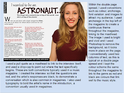
I used Prezi to create a Powerpoint-style presentation animation board to show the conventions of my magazine and how they link to present music magazines.